
Social Media Graphics for Listings: How to Design One That Works
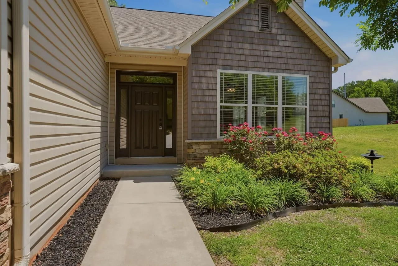
A “just listed” post gets a quick glance before the thumb moves on. The photo does most of that. The graphic around it has one job: tell the viewer what they’re looking at and what to do next, without making them squint. Here’s how we’d build one.
Start with the right photo
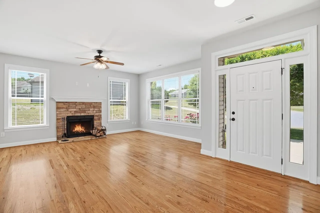
Lead with the shot that makes the house look like somewhere you’d want to be, which is usually not the front elevation. A bright, open living space or a kitchen with a view reads faster on a phone than a wide exterior. Pick a photo with a calm area where text can sit, such as a wall, a ceiling or a lawn, so the words don’t land on top of the thing you want people to see.
A good photo set makes this easy, since you have options. If you only have one decent frame, the graphic won’t fix it. The editing choices behind a clean listing photo matter here more than the layout does.
One message per graphic
Decide what the post is for before you open the design tool. “Just listed,” “open house Sunday,” “price improved” and “under contract” are four different graphics. A graphic that tries to say three of them says none.
The usual information is short:
- The message in big type (Just Listed, Open House).
- The neighborhood or city, and the price if you’re showing it.
- Beds, baths and square footage, in one line.
- Your name, brokerage and one way to reach you.
Check your state’s advertising rules for what has to appear, since brokerage name requirements differ. Anything beyond that belongs in the caption.
Type that survives a phone
Most people see the graphic on a phone, so test it at phone size. Two typefaces is plenty: one for the headline, one for the details. Use a big size contrast between them. If you have to ask whether something is readable, it isn’t.
Put dark text on light areas or light text on dark areas, and don’t fight the photo. When the background is busy, a soft dark band behind the text beats a thick outline. Keep the text short. Five words of headline will be read. Fifty won’t.
Sizes and safe zones
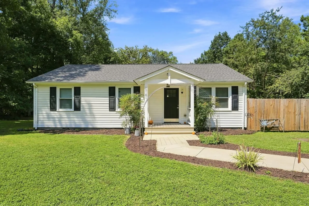
Design for the placement. A square (1080 by 1080 pixels) or 4:5 portrait graphic (1080 by 1350) works in most feeds, and a tall 9:16 graphic (1080 by 1920) suits stories and Reels. In the tall format, keep text away from the top and bottom, where the platform’s buttons and captions sit. We cover framing for the tall format in our guide to shooting vertical video.
Build a template and reuse it
Consistency is what builds recognition. Pick your colors, your two typefaces and your logo placement once, then build a template for each message type. Every post then looks like yours, and each new listing takes minutes. Match the colors to your brokerage brand rules if you have them.
Keep the style plain. A listing graphic should make the house look good, not show off the designer.
Where the graphic goes
Post it on your feed and stories, put it in a text or email to your sphere, and make a print version for the open house (see our post on listing flyers and print layout). Launch posts for your listing are coming.
Beyond All Media shoots photo, video and aerials across Upstate SC, Columbia and Richmond. South Carolina (864) 714-0724, Richmond (804) 913-3013.