
Listing Flyers and Print Marketing: Layout Basics for Agents
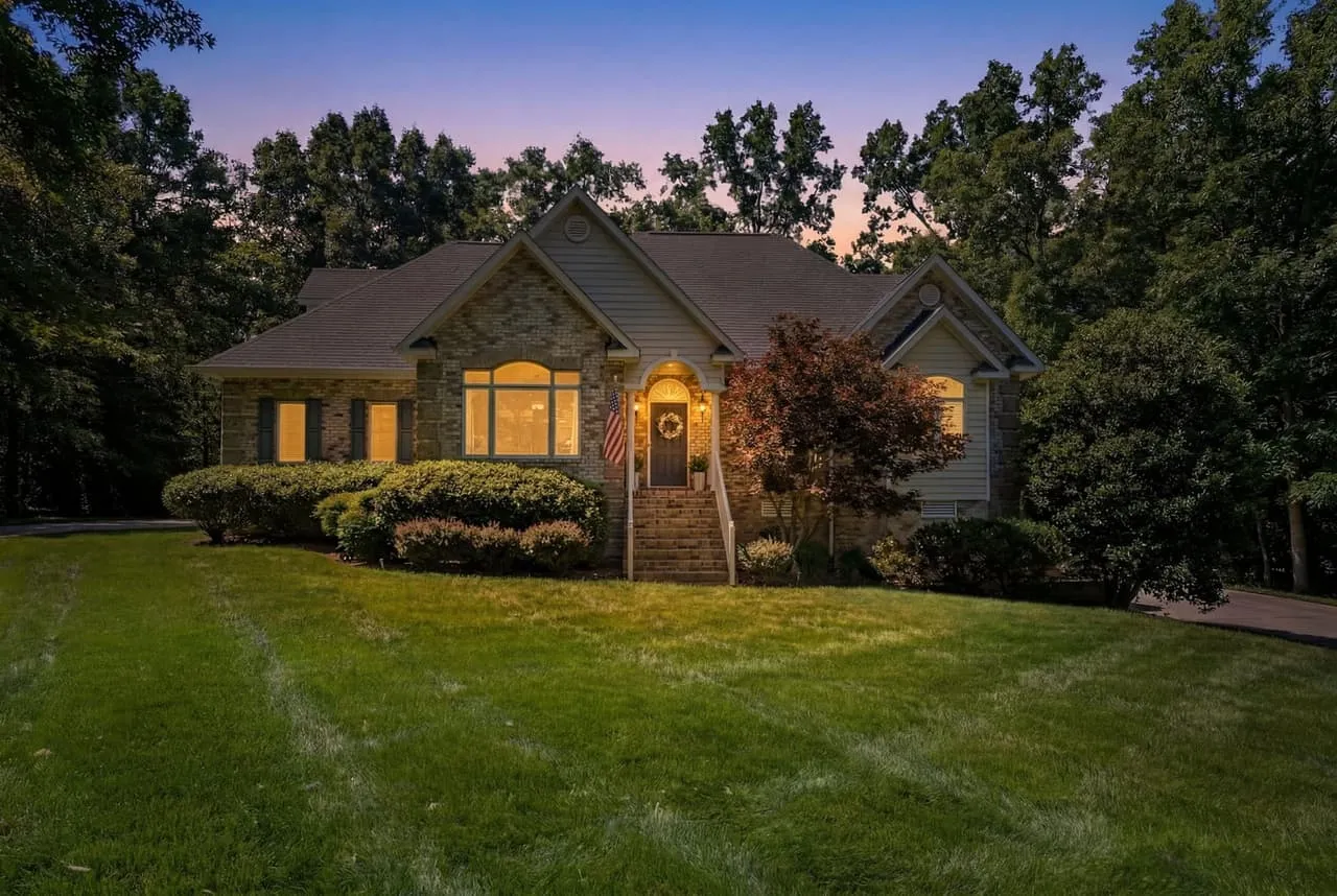
A printed flyer is still the thing buyers take home from an open house. It sits on the refrigerator, and it’s what they compare against the other four houses they saw that day. So it needs to be readable at a glance and honest about the house. Here’s the layout we’d use.
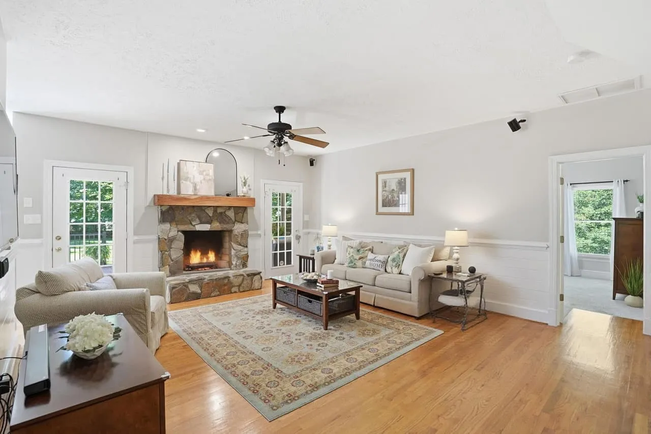
One hero photo, then supporting shots
Give the best photo most of the page. The viewer should know within a second what the house looks like. Then add three or four smaller photos that show different things: the kitchen, the primary suite, the outdoor space. Resist the urge to fit eight. A crowded page makes every photo look smaller and the house look smaller too.
Ask for full-resolution files for print. A photo that looks fine on a phone can look soft on paper.
What goes on the page
Keep it to the facts a buyer scans for.
- Address (or neighborhood, if the seller prefers), price, beds, baths and square footage.
- Three to five highlights, written as short phrases, such as “fenced backyard” or “primary suite on the main level.”
- The floor plan, if you have one. Buyers keep these. See when a floor plan is worth adding.
- A QR code that links to the tour or video, if you have one.
- Your name, brokerage and contact info, laid out the way your state’s advertising rules require.
Leave out anything that reads like a paragraph. If a sentence needs a comma, it probably belongs in the listing description and not on the flyer.
Type and contrast
Use two typefaces, one for headings and one for body text, and keep the body at a size someone can read at arm’s length. Big contrast between heading and body makes the page easy to scan. Dark text on a light background is the safest choice for the details, and a photo overlay should have enough contrast that the words don’t fade.
Negative space is not wasted space. It’s what gives the page a calm, confident look. A flyer with room around its elements looks like it belongs to a house worth seeing.
Print specs
A few basics keep you out of trouble with the printer:
- Export at 300 pixels per inch at the final size.
- Add 0.125 inch of bleed if the design runs to the edge, and keep text well inside the trim.
- Ask the printer whether they want CMYK or RGB. Bright blues and greens can shift when converted.
- Proof one copy on paper before you print fifty.
Color and consistency
Pull your colors from the brokerage brand or from the house itself, such as a front door color or a stone accent. Keep it to two or three. Use the same layout on every listing, and your flyers become recognizable from one open house to the next. Our post on social media graphics for listings walks through building the same kind of template for your feed.
Signs and anything seen from a distance
A yard sign or a banner follows different rules. People read it from a moving car, so it needs very few words, large type and strong contrast. Phone number and one line, nothing else. If the person has to slow down to read it, the layout has failed.
Tie print to the digital listing
The best flyers send people somewhere. A QR code to a 3D tour lets a buyer keep exploring after they leave. We cover why that works in why 3D tours win listings, and the tour types guide helps you pick which format to link.
For how photos, tours and floor plans fit in a listing order, see the packages page. Beyond All Media serves agents and builders across Upstate SC, Columbia and Richmond. South Carolina (864) 714-0724, Richmond (804) 913-3013.